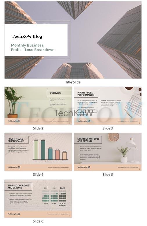
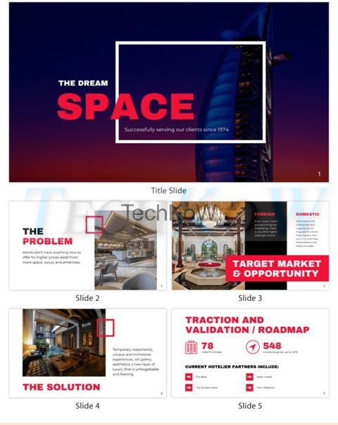
Before we begin, let’s first answer, what is a pitch deck? Presentation decks usually include presentation slides. A presentation slide is essentially a page where you can present your ideas to the audience and convey your message. There are a lot of pitch deck examples you can take inspiration from, so it doesn’t matter if you don’t have fantastic design skills.
What makes a good presentation slide? Here are 10 pitch deck best practices you should know on how to make a pitch deck:

1. Create Blank Space on Each Slide
Make sure that there is enough pure blank space on each presentation slide to enable your audience to read and comprehend what’s written on it easier. As we know, humans have this natural tendency for reading from left to right and top to bottom. So, making your presentation deck legible according to the standard human behavior will help increase your audience’s attention. Doing so will enable you to successfully deliver the message you want them to receive.

2. Make Each Slide Different From One Another
Don’t make all presentation slides similar. Instead of that, try to make each slide different by inserting an image or graph related to your content. Inserting pictures and diagrams will make your presentation more visually appealing and easier to understand, especially when creating a finance pitch deck like this one.
3. Using Font Size Between 18-24 for Whole Presentation Slides
Make sure the font size you choose for your slide deck is between 18-24, so it will be legible enough for people with poor eyesight to read easily. Also, avoid using tiny font sizes as it can be difficult for everyone to read even if they have good vision.
4. Incorporating Images/Graphs on Each Slide
When you make a pitch deck, always add images and graphs on each presentation slide to make it more attractive and exciting to your audience. There are many ways to do this, such as SmartArt, charts, graphs, diagrams, pictures, and more. A great example of this is this Investor Pitch Deck.
5. Incorporating 3D Effects on Presentation Slides
3D effects can help enhance the look of your presentation slides. They also serve as an additional decoration element which is very helpful in grabbing the audience’s attention.

6. Using Colors Between 2-4 on Each Slide
Avoid using more than four colors on your deck, as it will be overwhelming and challenging to understand for the audience.
7. Avoiding Using More Than 3 Bullet Points on Each Slide
Try to keep the number of bullet points on each presentation slide below three as it can be difficult for an audience to comprehend too much information at once.
8. Inserting Action Words in Your Presentation Slides
Inserting action words such as “imagine,” “create,” and “develop,” among others related to your presentation subject, will give life and more meaning to your presentation. This technique is called PowerPhrases and helps you make a better presentation.
9. Incorporating Call-to-Action Buttons on Your Slides
Call-to-action buttons help you encourage your audience to take action after watching your deck. You can also use sharing buttons to encourage people to share your presentation deck on social media.
10. Making Your Presentation Consistent with One Theme
Ensure all presentation slides have the same theme and color scheme to achieve a more uniform presentation deck.

11. Using Questions and Statements
Questions and statements help grab the audience’s attention and increase interest and curiosity towards your slides. They can also be used as a call-to-action tool that encourages your audience to take action after watching the presentation.
12. Avoiding Too Many Spelling and Grammatical Errors
Your presentation is the face of your business, so always make sure to proofread presentation slides before uploading them. Presentation decks with too many grammatical and spelling errors will make you look unprofessional, ignorant, and careless in front of your target audience.
13. Making Your Presentation Slides Short and Concise
Presentation slides should explain what you want to say to your viewers without adding extra information unrelated to the subject you are talking about. Make sure all presentation slides are concise. It can be challenging for audiences to stay focused and engaged if it contains too much information or text.
14. Incorporating Links to Your Presentation Slides
If you wish, you can add links in your slides to allow the audience to read more about your presentation content if they want to dig deeper. Linking back to previous presentations is an excellent way of encouraging viewers and staying relevant.
15. Adding Citations on Each Presentation Slide for Academic Purposes
Inserting citations on each slide is a good practice for academic purposes, as citing sources shows that the information contained in the deck is accurate and reliable. This technique helps increase your credibility as a presenter and avoid being accused of plagiarism which can have serious consequences.

Final Thoughts
Many tools such as Venngage can help you create better presentations without any cost at all! You don’t need to be an expert on how to create a pitch deck for investors, for sure. So what are you waiting for? Start making better presentations today with Venngage now.


